|
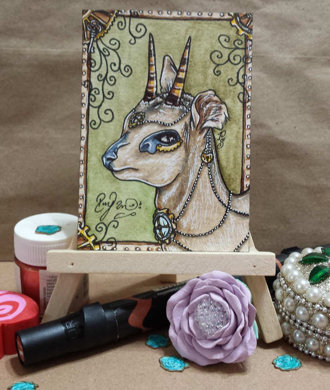
Intro: My first time attempting this Steampunk style/theme in art. I must say after making the "Fawn" ATC I was not all too happy to be working on this. I left it alone for a few weeks then came back with new ideas. I decided it was best to just take a normal drawing I have in mind and start adjusting it so that it fits a steampunk theme. These cards were made for a swap held on Instagram by Pabkins (#atcitupwithfriends).
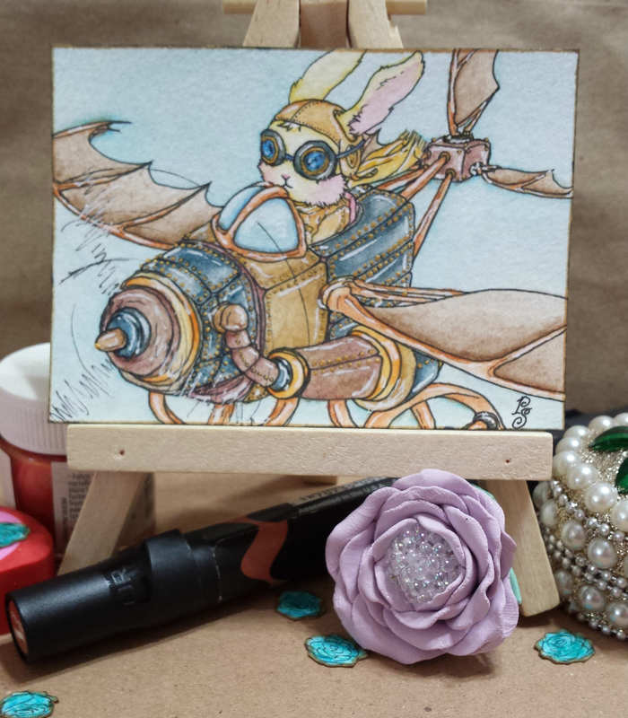
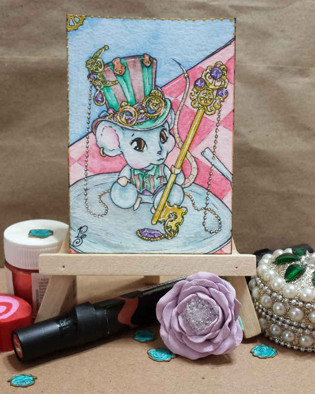
What I created: So I used these to continue my collection of "Steam This!" theme that I have in my ATC binder plus now moving on to a deco book. I'll just make prints of these to add to my personal binder. Using the regular tools of trade I added only one new material (you can see the little bottle sitting on the left). This is a small packet of 6 colors that I got while on my trip to India - Hobby Ideas Pearl Acrylic colors. This brand is amazing! Especially if you use these on clothes (which is what they are intended for). If used on clothes these are permanent (the fabric is going to fade but not the colors) and if used on paper they are like normal acrylic paints. I say this from experience: I made a dress back in 2011 and used the same colors on a tablecloth. The tablecloth was washed so many times over the years that the fabric is fading but the colors are just as bright as they were on day one! I feel more comfortable now making the steampunk theme now that I have some ideas on the elements that can be added. I still need to do more research though to make the art improve as I am not even 60% satisfied with what I have created. Final thoughts: I think if I get a hang of this, Steampunk might become a regular theme that appears in my future art. If things go well I just might finish this entire series of "Steam This!" ATCs.
1 Comment
Intro: I did not think that I would succeed in getting commissions so quickly... Once I posted the sale up I got 9 new commissions plus one from my regular price listing... so I have roughly 10 commissions that need to be completed. So yes it makes sense that I got lazy in posting any art any where... you can expect this to stay as is for the rest of this month as I am spending every free moment in making art instead of spending time online. Once I have art trades and such out of the way for this month then I'll be free to start posting again online (IG, dA, and AFA plus this blog).
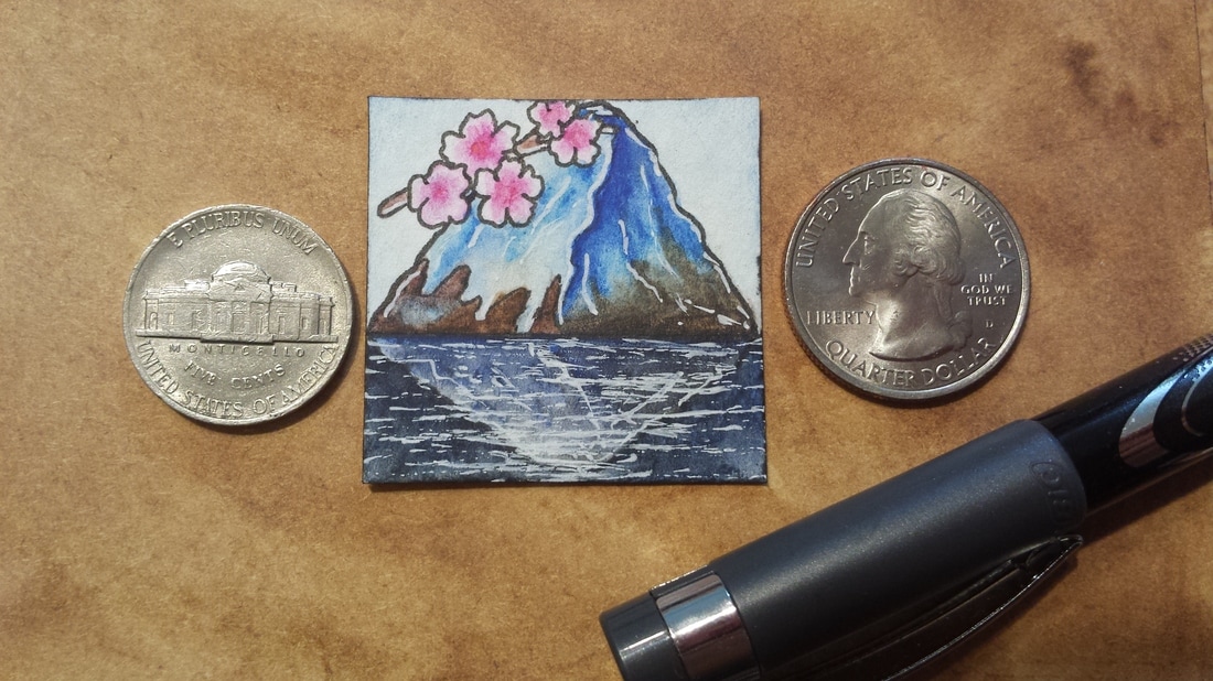
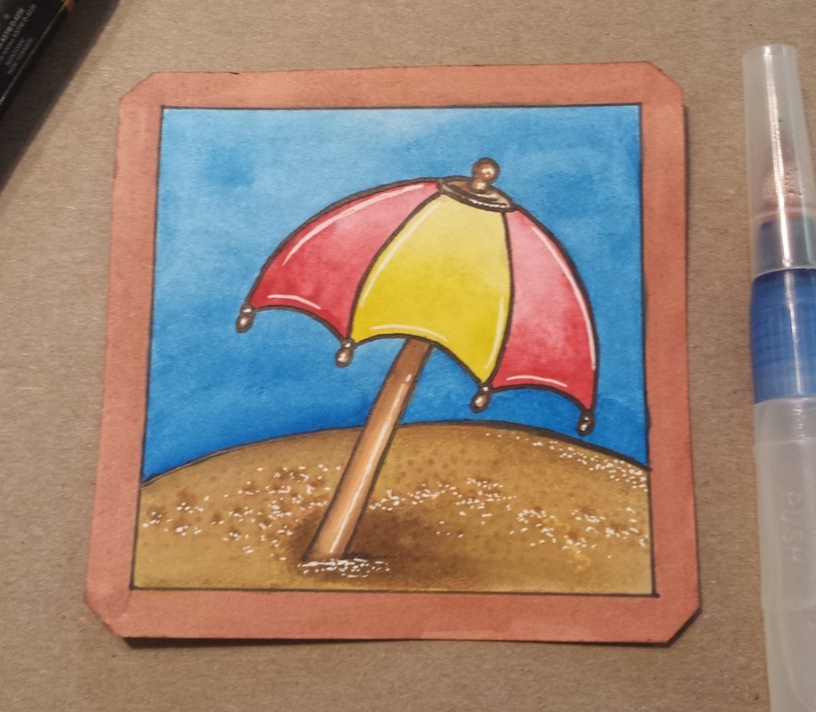
What I created: plenty of things!!! Too many to take images of as they are all either in pencil or only marker outlined (not colored). The only colored art I have are 4 betwinchies done for the #smallcanvaschallenge2017 plus my first attempt at Steampunk art. I also got 3 total Equines registered for ARPG (2 lovely Dyurs and a Moritzburger sport horse). I'll post those guys later when I have the rest of the registries completed and the other 3 steampunk ATCs done. So far...the small canvas challenge seems to be going great. We are getting participants making things on and off during the week on Instagram. I managed to complete 4 more tiles for week two and sketch out the next 3. I have decided it was better if I just posted them as sets by week when I get them done instead of posting them one at a time.. but it seems Instagram likes to see art one at a time. Enough with the ranting... Same materials as usual - absolutely nothing new was used. Sharpie for the nice cutting edges plus watercolor pencils, white gel pen, and Stadler liner. I am going to say that I am most proud of the Mt. Fuji emoji betwinchie that I made... I really got to test out my skills with water, reflections, and snow. I really love this tile...and I think this one and a few others might get carried over to ACEOs pretty soon. Happy easter everyone! For those that don't celebrate like me - just enjoy the sugar! I'll have a Easter themed Pocket Letter to share here shortly once it reaches its destination.... plus some more ATCs I made to put up for trades that are Easter themed as well. And...happy arting everyone! Let's make the rest of this month creative and productive! Intro: Recently I learned that creating IDs for everything seems to work best especially when sharing it on social media and for passing the word around quick...plus it makes it easier for the audience to get the information that is key without throwing too many words at them. I decided to create some test IDs for commissions first to see if I could even make them... What I created: I did not create an official template as I want it to be made once I have my logo and website up (I want it to match those colors). I used the handy dandy Microsoft Office Program slide designs available to create a nifty commissions ID. I am pleased with how calm and lovely it looks (for a first timer). I am liking the color so much that I am thinking about making my website to match (but that is not going to be). First: to celebrate the whole idea of commissions and finally launching them I am doing a 50% off sale on ACEOs. I have limited slots available with specific categories as these are the categories I am going to use on my website. 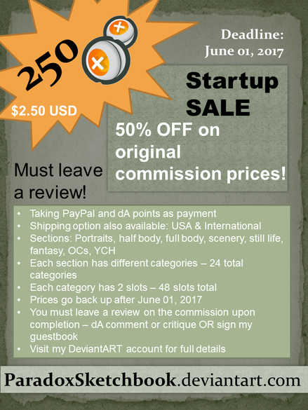 The only main reason behind the discount is - I am asking for a well written review/critique in return. Once the commissions is completed you must sign the guestbook or do a critique if on DeviantArt. I am trying to put together a page of commissions that have feedback so that future customers can have something to look at before making a decision. There are a total of 48 slots... so if all the slots fill up I'll have 48 reviews to add to my profile. And the customers get 50% off the original price on custom ACEOs! A win-win situation for everyone (I think). Second: This is just a mock-up...still testing the waters on this ID. I want to create an official ID for each canvas size I make as I'll be making an official listing for each canvas size (I am going to charge by canvas then further by my art stage). I do not think I'll be officially launching these till I have actual art I am happy to show off. I did think of another idea... perhaps I should set this up like a calendar? I would have the price, canvas details, and other relevant information in a small section at the bottom with my name and title at the top. Majority of the entire ID (95%) would be just images set up like in a calendar in the middle. 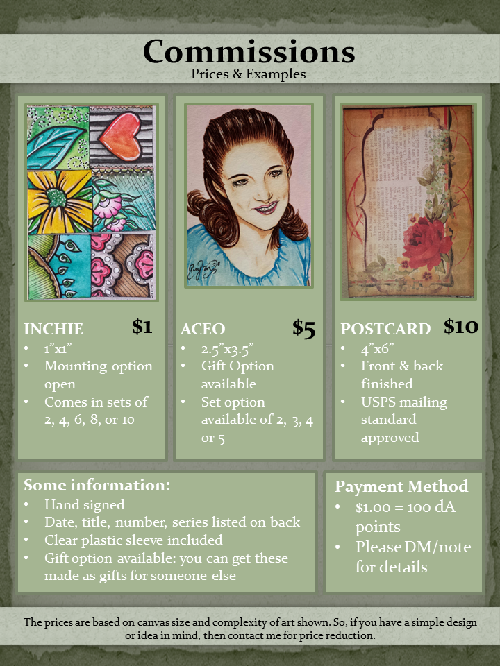 I feel that the current ID mock-up has too much words and not enough images... The thing is: when I'll be uploading these IDs I'll have an "About" or "description" section where I'll write up all the details... including available slots and rules and such. So I thought, if I already am using another spot for words then why repeat?
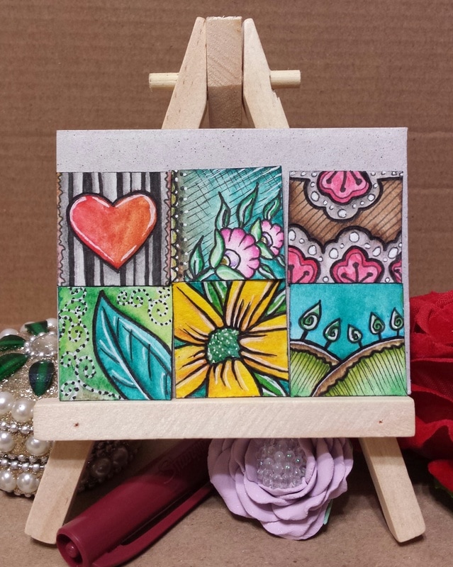
Still thinking it over..... Intro: Hello everyone! Just wanted to share a recent batch of inchies that I made. I never got a chance to upload these on here... 3 sets were made for swaps on ATCsForAll while the last (Whimsical) set was part of a personal trade.
What I created: I followed the themes that were set out for the swaps.... using my normal tools of watercolor pencils, Stadler liner, and white gel pen. I did nothing fancy to these inchies as I wanted to get used to the watercolor pencils first. The next batch is going to be more creative as I'll add more materials to the list.
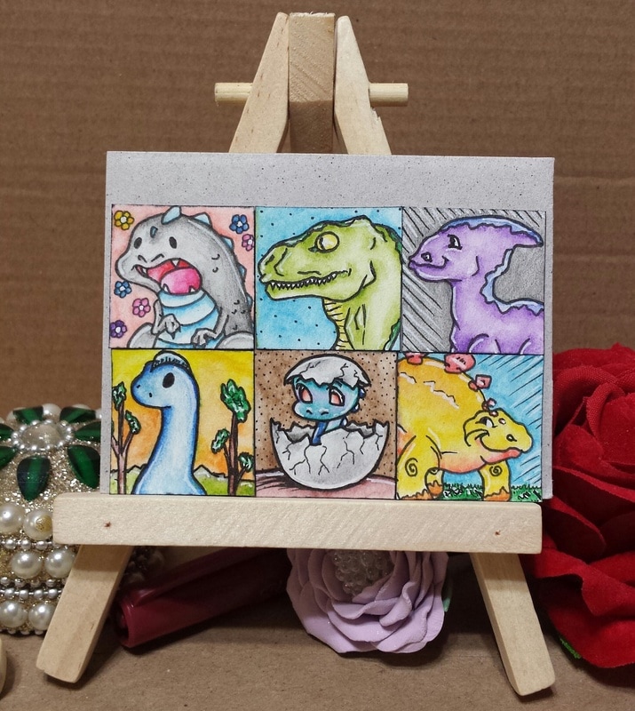
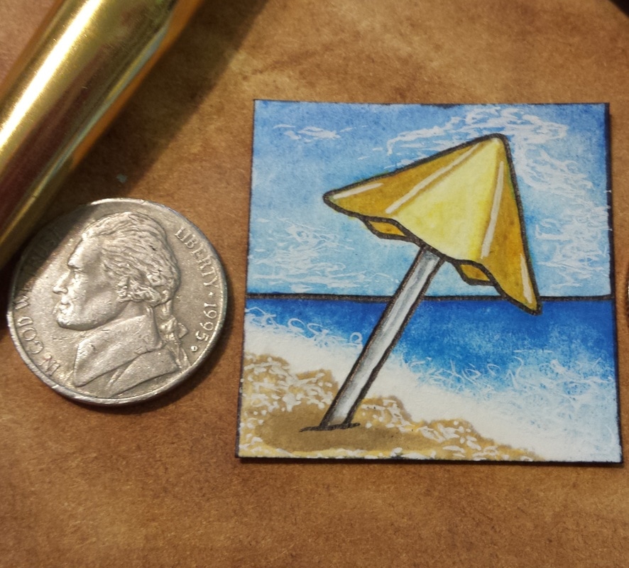
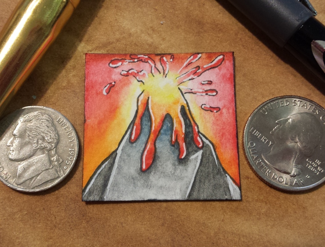
The little baby dino in the egg is now going to be an official YYH (your character here) option that I'll release in inchie and ATC sized formats (commissionable). Along with that I am going to be making some ATCs that are whimsical...perhaps some postcards too. Intro: this challenge has been going off great so far. I have managed to get an emoji scenery tile done for each day of the first week!
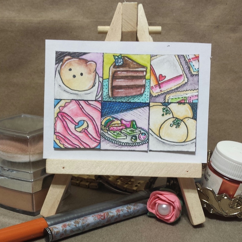
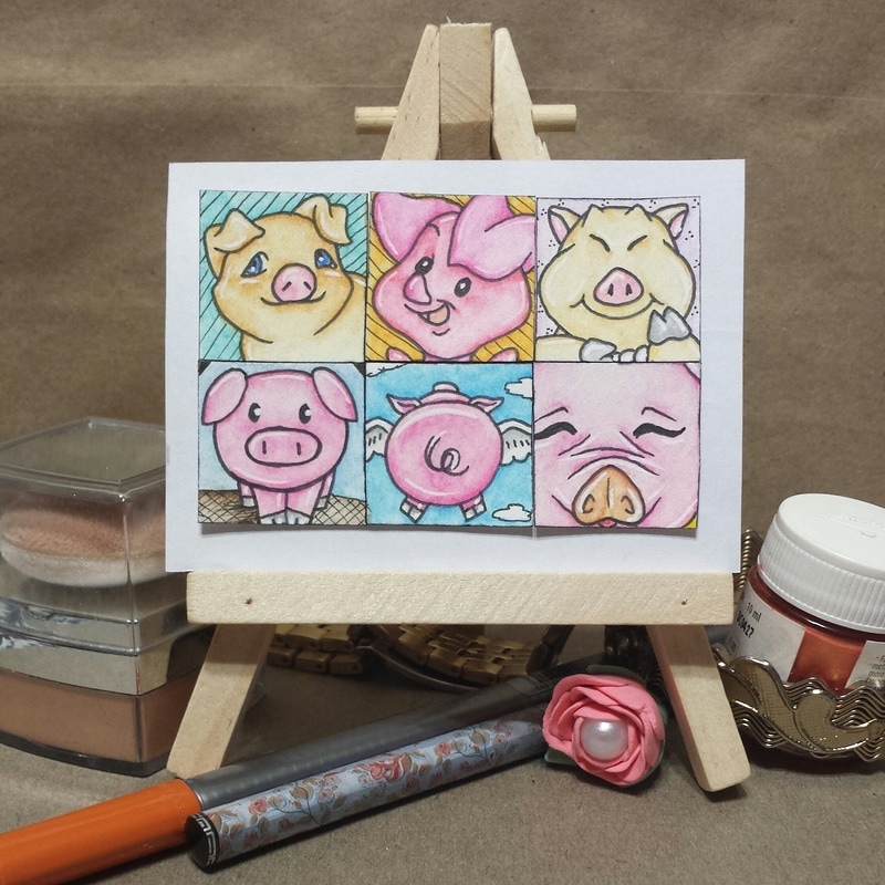
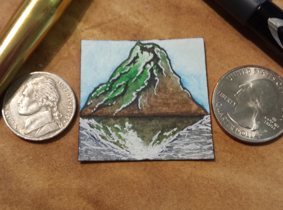
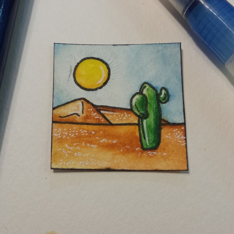
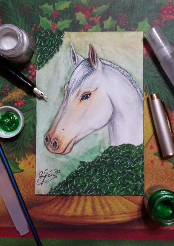
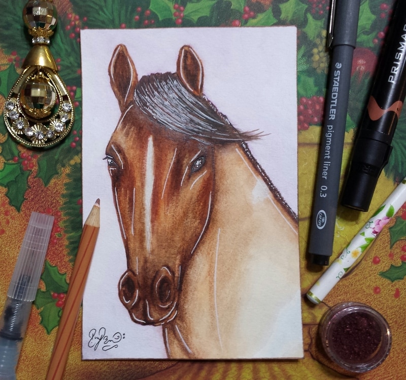
Issues: I had a feeling that the canvas I had originally picked was going to cause me problems...and it did! The pack of artist tiles that I had set aside for this challenge is 300gsm regular print paper and watercolor does not work too great on them. I only created Day 01 on this paper before tossing it aside... I ended up switching back to what I am most used to - cold pressed watercolor paper. Which actually worked wonders! The original tiles were 3.5"x3.5" and I created a frame around the tiles so that I had a 3"x3" surface to paint on. What I created: When I switched over to cold pressed watercolor paper I used scraps that I get when I cut a 9"x12" paper into ATCs. The scraps are great because I can cut them perfectly into 1.5"x1.5" tiles (also called betwinchies as the size in between inchies and twinchies). These would be considered as mini artist tiles as well but I think artists are more familiar with the term betwinchies when looking at those measurements. I stuck to my theme, and plan to for the rest of the month. I used my normal tools of watercolor paints, watercolor pencils, Stadler liners, white gel pen, distress ink, and Prismacolor markers. I almost felt like switching over to acrylic paints but at the last second decided against it as I do not get use multiple mediums when I work with acrylic paint. Final thoughts: for those that are interested - don't forget that this is laid back with no strict guidelines or deadlines! So just jump in and out when you have time! Congratulations on those of us doing this challenge (mainly on Instagram) and for surviving week one!!! Intro: My first ARPG references are finally done! I was able to successfully get these two beauties for the Kahuvaa breed group.
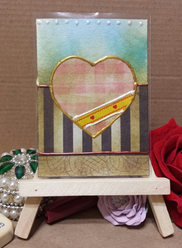
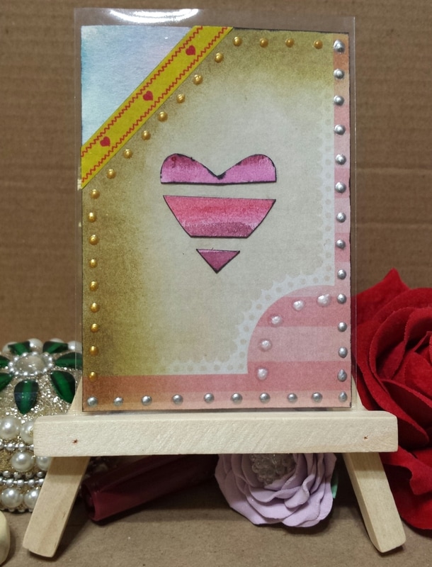
What I created: I decided to make two portraits on postcard sized watercolor paper for both of them. I ended up coming up with names on the spot when uploading them to dA. I tested some watercolor pencils with these two references on top of watercolor paint to see if anything got muddy... and it did not. Everything flows as it should with watercolors. I do not think I like using the watercolor pencils for covering a large area (like the background and even the horses). They work great for small sections when you have to lay down one color type in a small part but for covering large parts the pencils are not great. Good thing I learned this now and not while creating a contest entry. With a few shows and some events going on at dA concerning horse focused ARPG groups you'll be seeing plenty of horse art from me. I hope by drawing and painting them more I am able to better understand the different structures and features of each breed. Intro: And I present to you the last of my Valentine themed ATCs (I hope) for this year. I made these 2 specifically to open up for trading. Finally tried my hand at using distress ink on scrapbook paper.
What I created: 2 ATCs that I think are categorized as "mixed media" due to the materials I used. I have been itching to use a stack of scrapbook paper that I purchased from Michaels and finally got to use them for these two cards. I think I got carried away with the distress ink but I think they still look decent. For one heart I carried on that theme of using watercolor painted scraps to put together as a shape. I had a few strips left over for a postcard that I mailed out and so decided to make one last heart out of them. I really like these cards as they show just how many different materials I finally used (some for the first time) and got to experiment with. I tried using washi tape (first time ever touching these) but I don't think I fully understand their function enough to know what exactly I can accomplish with them. I also added some puffy paint to the cards for some dimensional effects. Final thoughts: I feel as if I should always create 3 cards at a time or 4 when trying to experiment... I had more ideas when I was creating these cards but could only do so much as I was only making two. Note to self: only make three or four cards at a time. Hello dear reader and visitor! As you might have noticed that more pages have been added to the navigation. Not all of the pages have been officially published as I am working on adding more content and changing some things around. Please be patient while I work on making this place better for you. Some things that have been added:
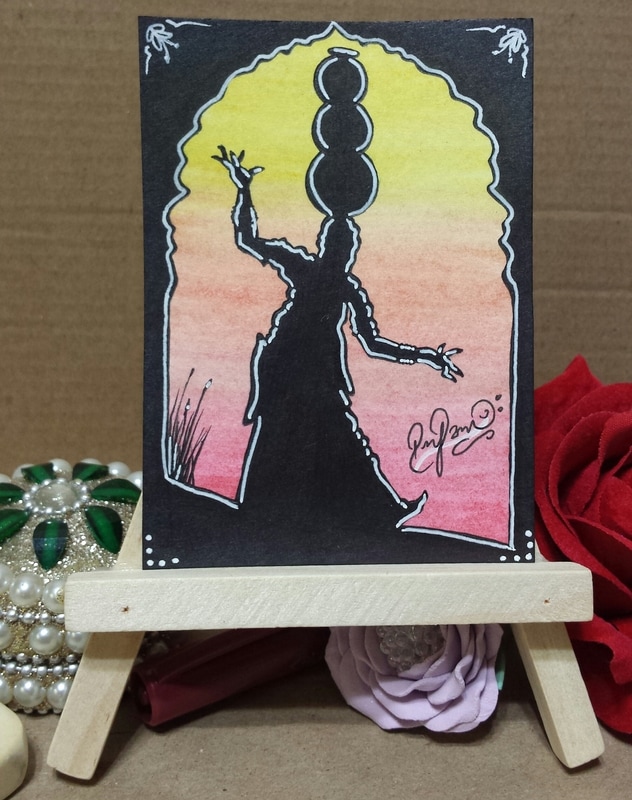
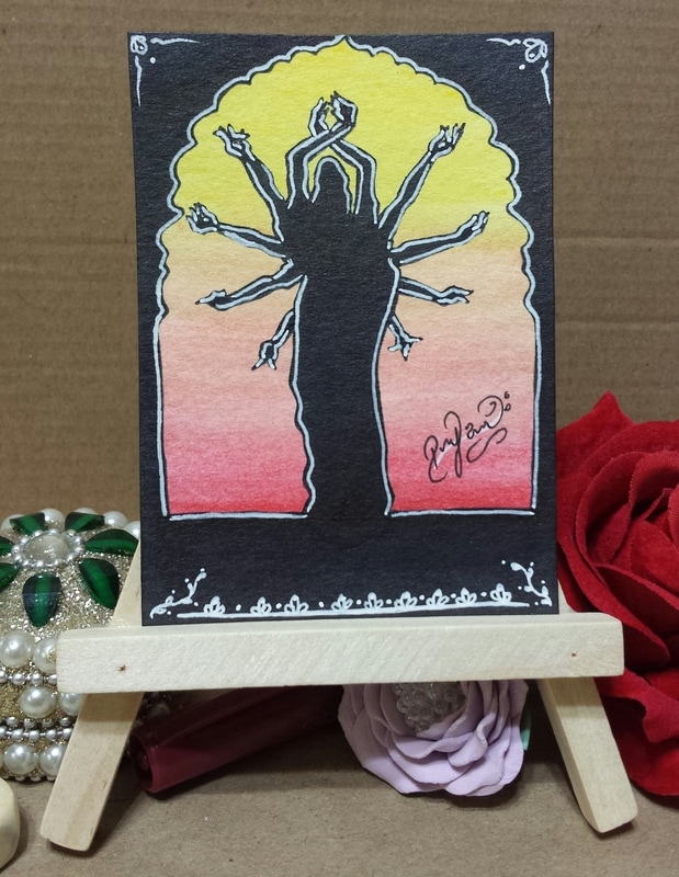
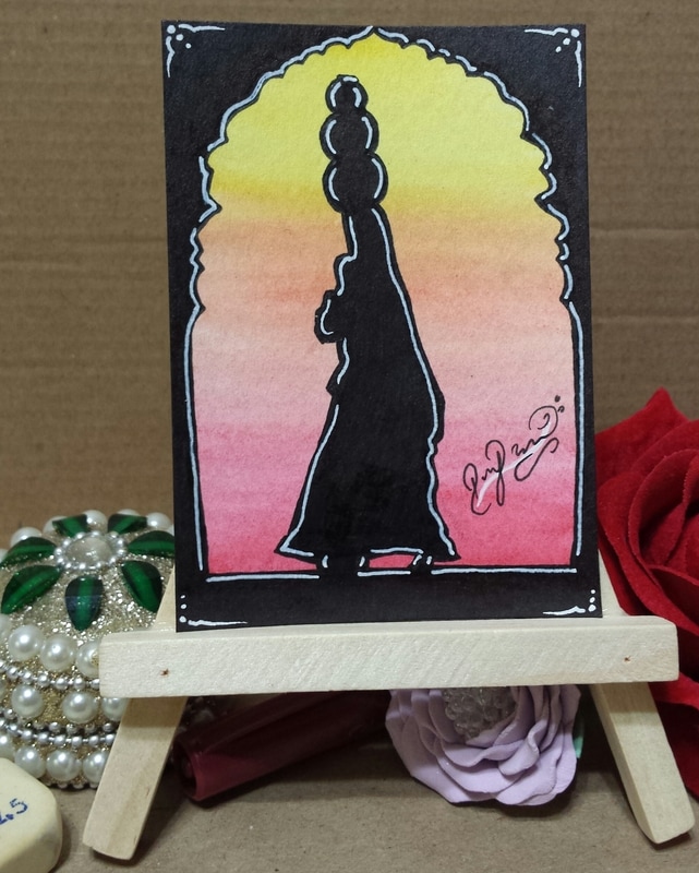
Intro: I finally got around to testing my skills on working with silhouettes... and boy are they difficult to make! I had no idea it could take so much thought to creating something that looks simple but really is not. I made these specifically to open up for trading.
What I created: I ended up making 3 ATCs of the same theme... I felt inspired by some images I had looked at in the past for a school project. I was researching the different clothes and jewelry that is worn in India and ended up saving a bunch of the pictures I found. I sketched the women with a pencil first then decided I wanted a little frame that would be the same for all three. I ended up creating a template on copy paper which I first cut out then used as a guide to make the frame. As you can see, I tried my best to make all three the same yet all three different all at once. I was originally going to keep them just black and white but then loved the idea of hinting at a sunset. I know I got a little carried away with the white gel pen but I have been trying to find a way to use strong black and white lines that fit my style. Materials: watercolor pencils, sharpie, Stadler liners, white roll gel pen, and Le Pen markers. Made on cold pressed watercolor paper. Intro: For those that are interested in this form of snail mail art please read: Deco 101 I have listed details on what I am willing to accept for books plus details on my own books. At the end of this post are instructions on what to do with any of my deco books if you are going to be or have worked on them. Details on Deco Books that I can take: I prefer to work with these mediums: markers, watercolor pencils, watercolor paints, acrylic paint, distress inks, color brush pens, other inks, and detailers (white gel pens or multiliners). Themes I prefer to work on: Any! I am open to any themes but I do love these as I feel more comfortable with them: goddesses, whimsical, pigs, owls, pandas (black&white or red), butterflies, drinks (tea, coffee, etc), food, animals, people (portraits or full body in realistic, comic, or anime form), fashion, flowers, nature (I love mother goddess), curiosity cabinets (kunstkammer), tarot cards, affirmation or oracle cards, origami, steampunk, gothic, victorian, girly (pink and glittery), dragons, pirates, fairy tales, marigolds, roses, harpy eagles, hawks, fantasy creatures, ARPG related, willing to try something new. Not willing to work on anything that requires gore, profanity, promoting a religion (I like making art related to religion but I'll not be promoting any), hard-core politics, suggestive... My Deco Books - Information These are my deco books that have yet to leave my house or are in transit but need artists. I have linked some Pinterest Boards that somewhat help with the theme of each book (if one is available) to help you get some ideas. I have some deco books in the following format: Deco book Name | theme | size | total number of pages in book | number of pages completed | medium | extra info | Pinterest Board | current location | next location
Binding: I am a bit picky on binding...and because my OCD kicks in during binding I like to get pages for anything that I am making done first before I bind them. I am okay with working on pages for something that was bought with the binding already done but if binding is an option that can be completed later then I prefer it that way. I personally feel that the binding sometimes prevents us from creating properly (it does for me). Don'ts: same things that I am not willing to work on are not to be included in my deco books...pretty please. Some nudity is allowed but nothing crazy. Try to keep the religious and political themes tuned down a little but they are not entirely banned. Absolutely no gore or extreme violence. I have a bunch of nephews and nieces that love to look at these so please keep that in mind. Mailing Details: Sending a whole book eventually starts costing more than 1 stamp and for this reason I offer you two options. Either you can make the pages yourself (following the measurements listed here) or I can mail the number of pages you would like to work on along with your trade. Please send me an email at ParadoxSketchbook @ gmail dot com if you are interested in these or get in touch with me on any social network that I am on. I want to get these ones done before opening a few other ones that I have prepared (odd shaped ones). What to do with my deco books.
|
Author: RejiI used to be a digital artist but switched back to traditional art as I feel more connected with the art I create this way. Currently, I create art whenever I can for art trades and commissions. I have worked with clay (earth clay to modern forms like Polymer, Sculpey, even Air Dry clay) along with watercolors, acrylics, oil paints, pastels, charcoal, pen and pencil drawings, India ink, Chinese Colors, wires, felt fabric, yarn, weaving, basket making, and the list goes on and on. I am currently working on exploring nail art, make-up, dress making, scrapbooking, and small canvas art. Archives
April 2017
Categories
All
Copyright © Reji Randhawa | The Paradox Sketchbook. All rights reserved.
 All work on this blog is licensed under a Creative Commons Attribution-NonCommercial-NoDerivatives 4.0 International License. |


 RSS Feed
