|
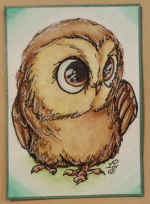
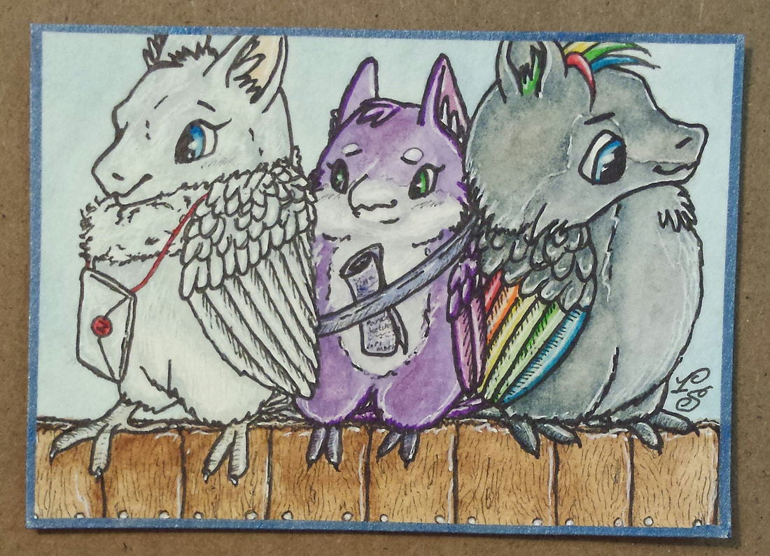
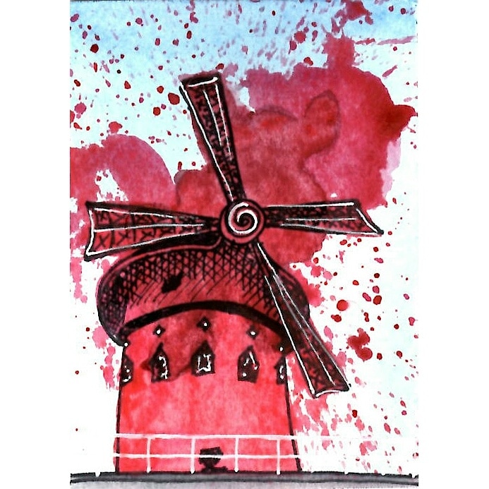
Some odd ACEOs that I wanted to share as they all are really different from each other. I made a bunch more art as well but they are not ATCs (mainly chunky pages and inchies). These are pending for now, if available shall be posted to AFA or iATCs. All done in watercolors with some sharpie fineliners (that ended up acting as watercolors anyways). A few more coming in the next post but for now here they are...
0 Comments
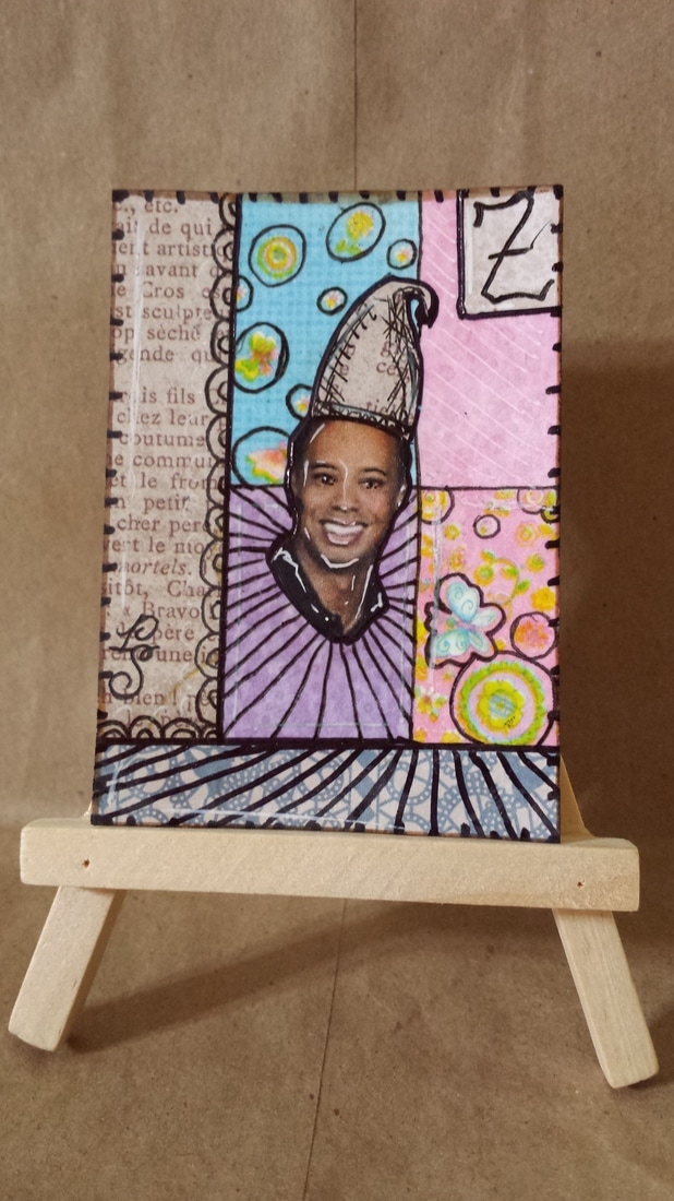
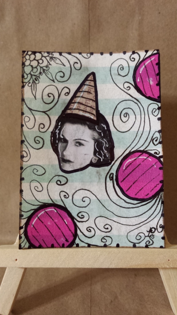
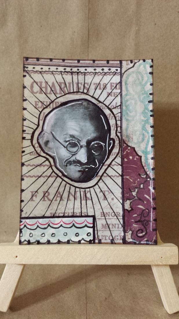
Intro: I joined the Zettis of Historical Figures swap on AFA... why? I need to loosen up the stress I put on myself by doing paintings with details. I need to learn to collage and just have fun when working with multiple mediums. And more than anything - the images I see on Pinterest for zettis really look amazing to me...and I need to just make some that are like that. What I created: I made (attempted) my first ever collage cards...first time doing collage for anything actually. I did 4 cards total using plenty of bits I had left over from pocket letters. I am not really proud of them but there is really nothing I can do with the supplies I have. I do think I need to get actual acrylic paint to make these better or some other mediums that I see being used on YouTube. I tried not to focus on drawing... but I still didn't like how they looked so in the end took a marker and doodled all over them... not sure if that makes them look better or worse now?
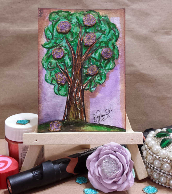
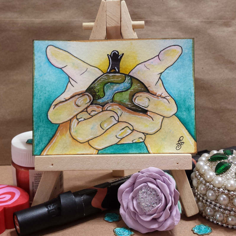
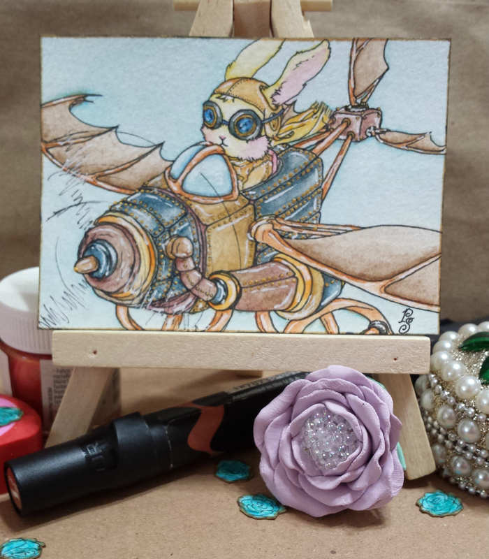
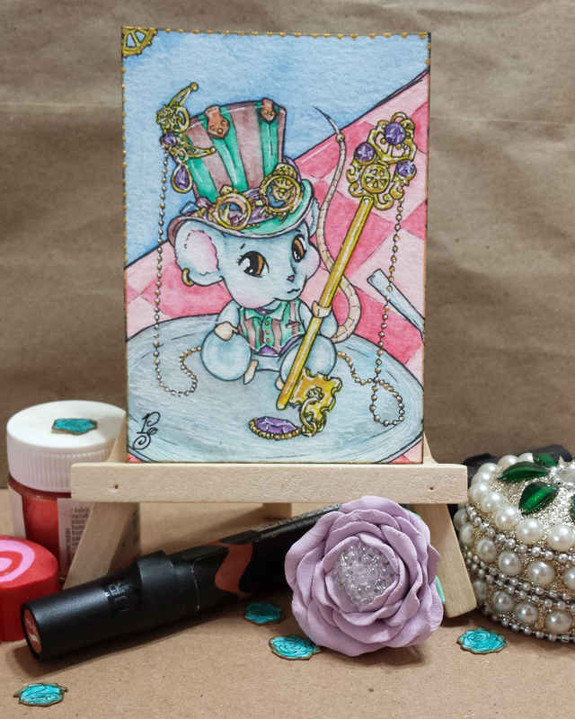
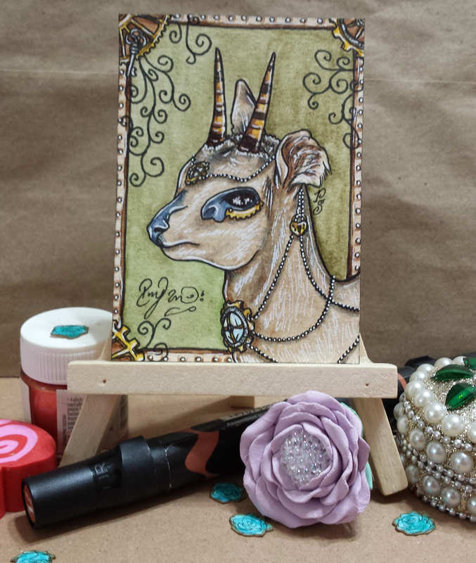
Intro: Well a belated Happy Earth Day everyone! I hadn't forgotten it as I was already doing a trade focused on this day on Facebook. I just didn't get a chance to post about it here yet. So with this great day I bring some new things for us to look at! What I created: I made 2 ATCs for a trade on a Facebook group called Studio A B See. We all sign up and afterwards are randomly assigned partners that we mail 2 ATCs out to going with the theme of that month. The theme was "grow" but I already knew Earth Day was in April as well so I thought "what better way to show a growth theme than to focus on Earth". I wanted to make these cards special just because I was feeling really connected to the theme...and thus I gave myself some opportunities for growth (and learning). YSH: Your Subject Here (or for those on dA this is the Your Character Here image)... I have been wanting to release some of these as options for commissions and decided to attempt it when I first did the hands. I originally planned some dirt with a small plant taking form in the hands but scratched that idea once the hands were completely drawn out. Instead, I saved a scanned copy of just the hands to use as a YCH image. For those that are not used to these terms: typically an artist can create a pose or a background and post it up for anyone who wants to commission the same art being drawn again but changed a bit. In some cases (like with a pose) you edit the character to look like what the commissioner wants while keeping the pose. In other cases you just have a background that you can get a character (or more than one) place in the background. 2D/3D Elements: The small hill with a person standing on top was going to be the second card but I decided to combine the two instead. When I started sketching this person and hill I wanted them to somehow pop out because of the small size that they were made as. This of course got me so excited that I ended up wanting to use the same method on the second card. I made some roses... 8 at first and found that they were so natural to make that I just kept making till I had a total of 30 roses made. I only used 8 on the second card but started planning on more trees of different colors for the other roses. I have some ideas in mind so be on a look out! Shimmering Paint: I have been watching plenty of calligraphy artists an even ATC makers who use shimmer paints to add small touches to their art. I have been waiting for the right art piece to come along to test this out on. I found it worked best with the rose leaves but stuck to the shimmer paint on my Steampunk cards as well. I think using these can be great if done for tiny details, but not so great for bigger areas as they tend to be flat in photographs and scans. Final thoughts: Plenty of experiments happened in this set... I need to get better cutting tools for one! I also need to get nib pens to work with the shimmer paints as brushes tend to have small moments of misery. I do think I like making cute mice and bunnies now... 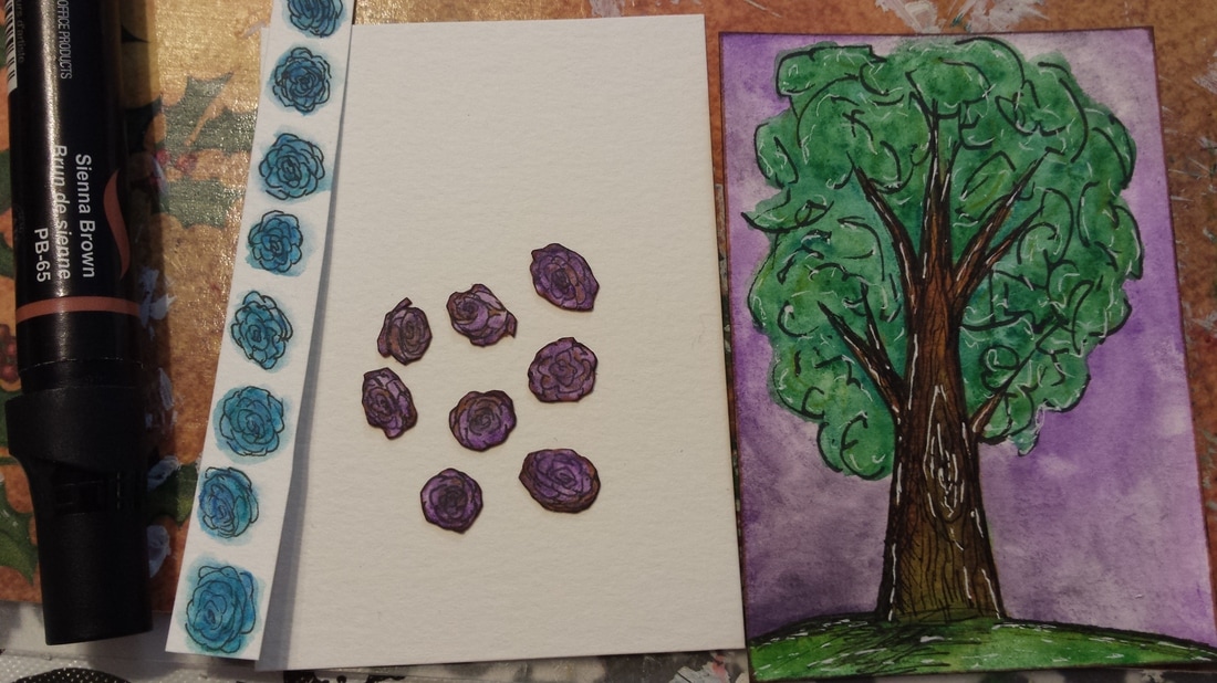 Intro: My first time attempting this Steampunk style/theme in art. I must say after making the "Fawn" ATC I was not all too happy to be working on this. I left it alone for a few weeks then came back with new ideas. I decided it was best to just take a normal drawing I have in mind and start adjusting it so that it fits a steampunk theme. These cards were made for a swap held on Instagram by Pabkins (#atcitupwithfriends).
What I created: So I used these to continue my collection of "Steam This!" theme that I have in my ATC binder plus now moving on to a deco book. I'll just make prints of these to add to my personal binder. Using the regular tools of trade I added only one new material (you can see the little bottle sitting on the left). This is a small packet of 6 colors that I got while on my trip to India - Hobby Ideas Pearl Acrylic colors. This brand is amazing! Especially if you use these on clothes (which is what they are intended for). If used on clothes these are permanent (the fabric is going to fade but not the colors) and if used on paper they are like normal acrylic paints. I say this from experience: I made a dress back in 2011 and used the same colors on a tablecloth. The tablecloth was washed so many times over the years that the fabric is fading but the colors are just as bright as they were on day one! I feel more comfortable now making the steampunk theme now that I have some ideas on the elements that can be added. I still need to do more research though to make the art improve as I am not even 60% satisfied with what I have created. Final thoughts: I think if I get a hang of this, Steampunk might become a regular theme that appears in my future art. If things go well I just might finish this entire series of "Steam This!" ATCs. Intro: And I present to you the last of my Valentine themed ATCs (I hope) for this year. I made these 2 specifically to open up for trading. Finally tried my hand at using distress ink on scrapbook paper.
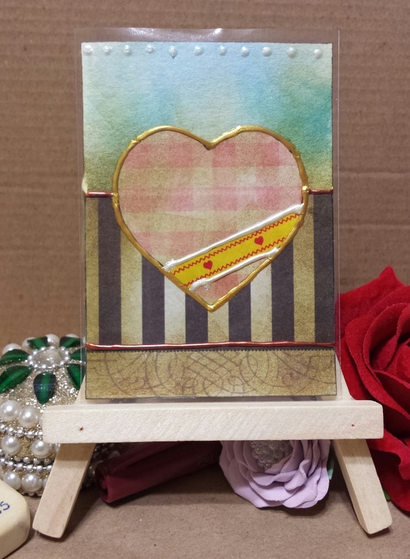
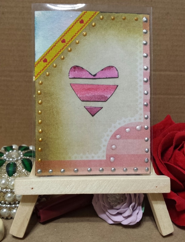
What I created: 2 ATCs that I think are categorized as "mixed media" due to the materials I used. I have been itching to use a stack of scrapbook paper that I purchased from Michaels and finally got to use them for these two cards. I think I got carried away with the distress ink but I think they still look decent. For one heart I carried on that theme of using watercolor painted scraps to put together as a shape. I had a few strips left over for a postcard that I mailed out and so decided to make one last heart out of them. I really like these cards as they show just how many different materials I finally used (some for the first time) and got to experiment with. I tried using washi tape (first time ever touching these) but I don't think I fully understand their function enough to know what exactly I can accomplish with them. I also added some puffy paint to the cards for some dimensional effects. Final thoughts: I feel as if I should always create 3 cards at a time or 4 when trying to experiment... I had more ideas when I was creating these cards but could only do so much as I was only making two. Note to self: only make three or four cards at a time. Intro: I finally got around to testing my skills on working with silhouettes... and boy are they difficult to make! I had no idea it could take so much thought to creating something that looks simple but really is not. I made these specifically to open up for trading.
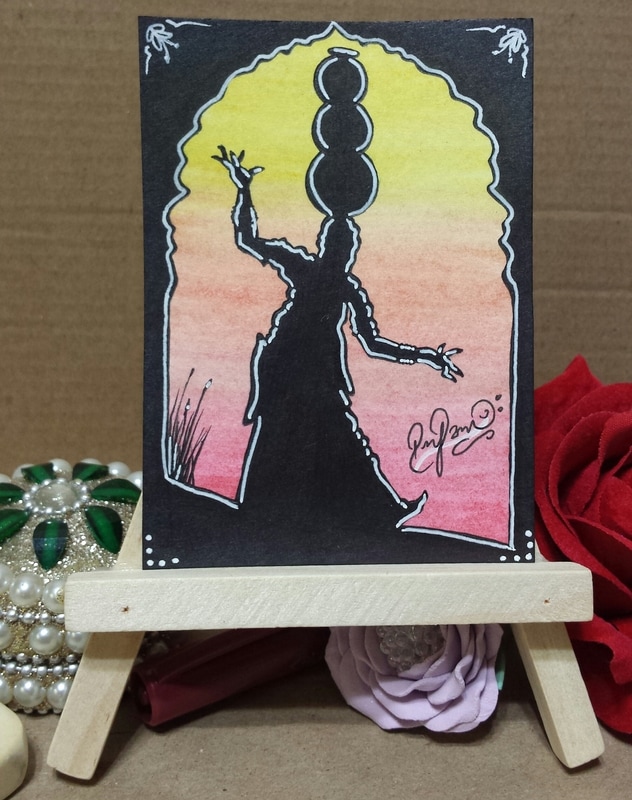
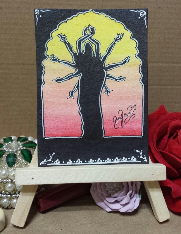
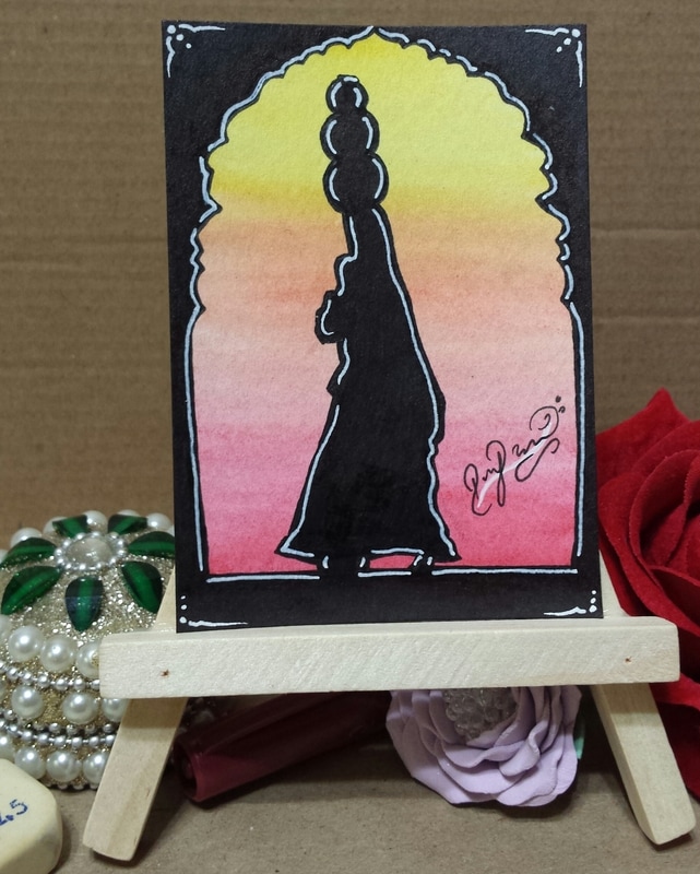
What I created: I ended up making 3 ATCs of the same theme... I felt inspired by some images I had looked at in the past for a school project. I was researching the different clothes and jewelry that is worn in India and ended up saving a bunch of the pictures I found. I sketched the women with a pencil first then decided I wanted a little frame that would be the same for all three. I ended up creating a template on copy paper which I first cut out then used as a guide to make the frame. As you can see, I tried my best to make all three the same yet all three different all at once. I was originally going to keep them just black and white but then loved the idea of hinting at a sunset. I know I got a little carried away with the white gel pen but I have been trying to find a way to use strong black and white lines that fit my style. Materials: watercolor pencils, sharpie, Stadler liners, white roll gel pen, and Le Pen markers. Made on cold pressed watercolor paper. Intro: I have started a project over on Kickstarter to finally take the steps that I need in order to bring the Paradox Sketchbook to life. I have to start somewhere and having prints available is a good starting point for a beginner like me. Samples: Below are some samples that I picked for anyone wanting to see what I have created using basic art materials bought from local stores (mainly Walmart). Imagine the quality and details that can improve if the materials that I worked with were better... ACEO - 2.5" x 3.5"Postcard - front - 4" x 6"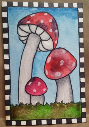 Whimsical Mushroom Landscape ACEOs made for trades ATC of Caretaker Melissa - Aurals 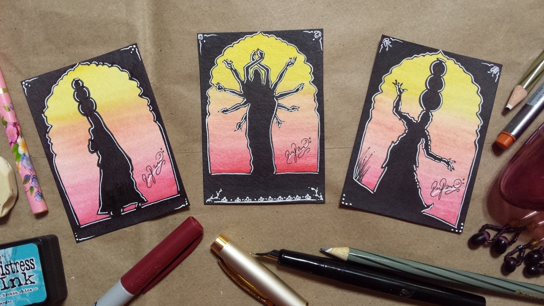 Silhouette Set of 3 - Whimsical People 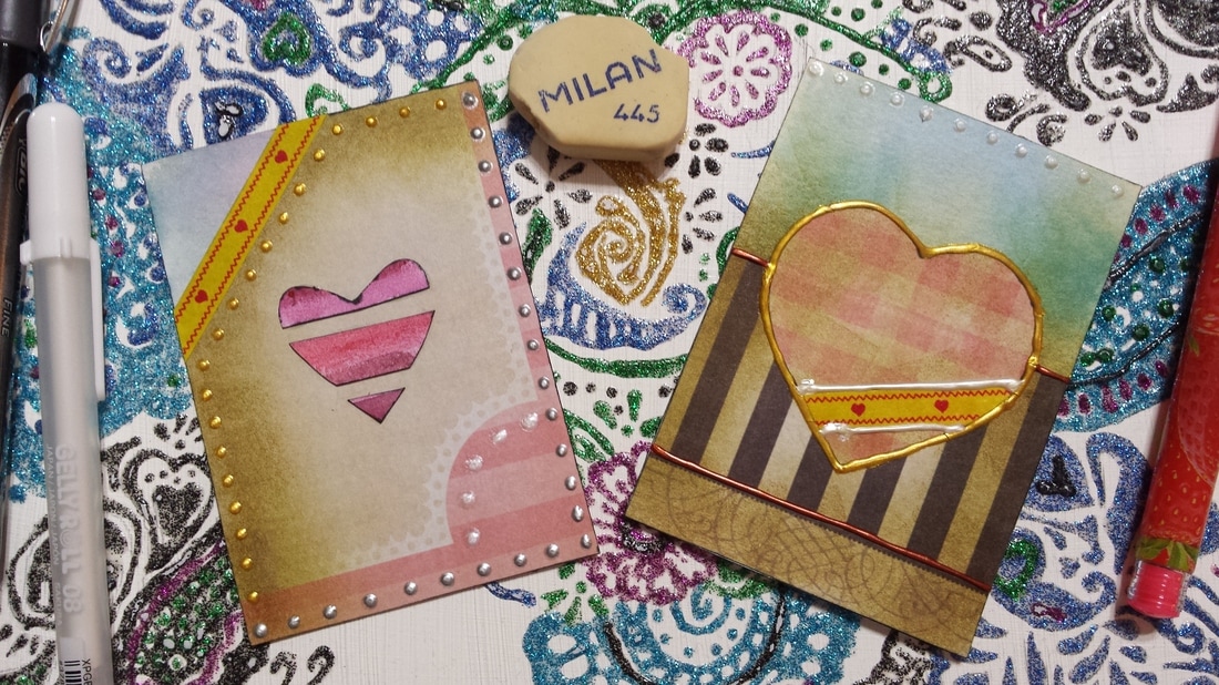 Valentine Exchange ACEOs - 2017 Thoughts: so you might be wondering where I plan on going with this? The goal in steps is to first get the high quality materials that are going to allow high quality art to be created. Then step 2 would be to get the materials needed to make high quality prints available for purchase. Once these two steps have been completed then the third step would be to set up shop. Mainly I would set up shop online but once in a while attend events and shows where I can have prints and other goodies available for purchase.
Now you might be wondering where is this going? What's the big deal on getting art prints out? The idea is to get fans... to spread the word about my name (the Paradox Sketchbook). I care about my fans and thus want to put effort into getting quality materials and a quality shop set up. I want to build a fan base so that in the end I can offer my fans something unique - publish my illustrated story. I want to get the story published first then work on a trading card game based off of it. I would think if my fans see that I care so much about them to put extra work into building up efforts and abilities so that what I give to them is my best work possible. If they see that I care then I would hope they return the favor and support me when I take on the journey to illustrate my story and release the trading card game. Intro: I recently was involved with multiple MMH (Make Me Happy threads) of ATCsForAll where we had to create postcards. Some of them had themes already decided by the person who they were made for and one had no theme at all. I was also participating in a Valentine Exchange that let me create 2 Valentine postcards. Along with an EAU thread - I got make my first envie and mail it off. There was also an art marathon going on that inspired me to make some heart themed ATCs. What I created: All of the snail mail art that I made used the following materials:
Note: For those that these were surprises for: I am sorry if they still have not arrived and I have already posted them here. It has been over 2 weeks since they were sent off, so I posted these keeping in mind that they have already arrived. The longest time for me was a trade completed in Slovakia and the cards reached their destination within two weeks. 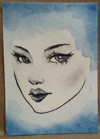 Call for critiques/suggestions!
I randomly made this ATC with no plan as to how to finish so now I am stuck. Any suggestions on what I could do to finish this portrait off? I have been wanting to avoid adding the ears and hair on, even the neck but I personally do not like how this looks right now. Any ideas? Intro: as predicted by myself... I got behind due to other art distractions! Woohoos for starting off my first challenge properly. At any rate... I am putting all efforts into this challenge now as I find it is helping me find my own art style. I am starting to figure out what things (elements, color choices, decorations, etc) I like putting in my art. I spent the weekend (partially) catching up but did not spend enough time. If I had spent some of Sunday catching up then I would have gotten ahead but that was not to be...
What I created: As you can see from the slideshow above, I created four total faces this weekend. I had only one sketched out before but I sketched the other three on Thursday. All four were painted Friday evening and majority of Saturday afternoon. All four are ATC sized (2.5"x3.5") and done in watercolors with some detailing in Le Pen marker and white gel pen. These are probably going to be the last of my ATC sized faces for this month... I have up to number 24 sketched out all on postcard sized canvases (4"x6"). I might for the last few come back to ATC just because they are quicker to finish but who knows...it'll depend on my mood. For Portrait #06 (Janine) I went and had a little experiment with materials and my style. I would say that it was fun but I would probably not make faces in this style again as I did not like how her hair turned out in the end. I used distress ink to lay down the foundation for background and some parts of the face. Then went in with watercolors on the face only. Added to that I used Prismacolor Markers to make the bold shading in the hair plus some areas of the face. Final touches were done with a white gel pen, Le Pen Marker, Sharpie Fine-Point. Further thoughts: Out of nowhere... I have gotten this blog an Instagram account (ParadoxSketchbook). I'll be focusing on uploading all of my work on there (all media, and all canvas types). I might eventually start sharing some works-in-progress and just other musings. Along with ARPG related art... that'll be big starting in March as I have officially joined 2 ARPGs and am in the process of working on joining 3 more. You ask why so many? Only because I know I get tired of drawing the same subject over and over again... so just to keep my creativity fresh and your eyes fresh it'll be nice to keep rotating between them all. I am planning on finishing up my first art related to an ARPG for a February event soon but it is not a priority right now. March has another challenge in store for me... Arch Triptych Challenge! I have already prepared the canvas that I'll be painting for the challenge... and soon to start coming up with themes and possible sketches this week. I hope you do join me when the time comes as I find the challenge quite entertaining. |
Author: RejiI used to be a digital artist but switched back to traditional art as I feel more connected with the art I create this way. Currently, I create art whenever I can for art trades and commissions. I have worked with clay (earth clay to modern forms like Polymer, Sculpey, even Air Dry clay) along with watercolors, acrylics, oil paints, pastels, charcoal, pen and pencil drawings, India ink, Chinese Colors, wires, felt fabric, yarn, weaving, basket making, and the list goes on and on. I am currently working on exploring nail art, make-up, dress making, scrapbooking, and small canvas art. Archives
April 2017
Categories
All
Copyright © Reji Randhawa | The Paradox Sketchbook. All rights reserved.
 All work on this blog is licensed under a Creative Commons Attribution-NonCommercial-NoDerivatives 4.0 International License. |


 RSS Feed
