|
Intro: Recently I learned that creating IDs for everything seems to work best especially when sharing it on social media and for passing the word around quick...plus it makes it easier for the audience to get the information that is key without throwing too many words at them. I decided to create some test IDs for commissions first to see if I could even make them... What I created: I did not create an official template as I want it to be made once I have my logo and website up (I want it to match those colors). I used the handy dandy Microsoft Office Program slide designs available to create a nifty commissions ID. I am pleased with how calm and lovely it looks (for a first timer). I am liking the color so much that I am thinking about making my website to match (but that is not going to be). First: to celebrate the whole idea of commissions and finally launching them I am doing a 50% off sale on ACEOs. I have limited slots available with specific categories as these are the categories I am going to use on my website. 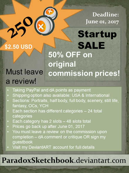 The only main reason behind the discount is - I am asking for a well written review/critique in return. Once the commissions is completed you must sign the guestbook or do a critique if on DeviantArt. I am trying to put together a page of commissions that have feedback so that future customers can have something to look at before making a decision. There are a total of 48 slots... so if all the slots fill up I'll have 48 reviews to add to my profile. And the customers get 50% off the original price on custom ACEOs! A win-win situation for everyone (I think). Second: This is just a mock-up...still testing the waters on this ID. I want to create an official ID for each canvas size I make as I'll be making an official listing for each canvas size (I am going to charge by canvas then further by my art stage). I do not think I'll be officially launching these till I have actual art I am happy to show off. I did think of another idea... perhaps I should set this up like a calendar? I would have the price, canvas details, and other relevant information in a small section at the bottom with my name and title at the top. Majority of the entire ID (95%) would be just images set up like in a calendar in the middle.  I feel that the current ID mock-up has too much words and not enough images... The thing is: when I'll be uploading these IDs I'll have an "About" or "description" section where I'll write up all the details... including available slots and rules and such. So I thought, if I already am using another spot for words then why repeat?
Still thinking it over.....
1 Comment
Intro: I wanted to dedicate a small post about the back of my ATCs. Some artist create their own templates while others download them (there are free templates available online). I created my own quick template using only two programs: I used cooltext.com for generating a simple title and then using MS PowerPoint I put together a template with two variations. Cooltext.com has many fonts and icons available to use for free... so if you want to create your own template from there you can. I have included the MS PowerPoint template at the bottom of this post along with the image version that you can use as well. These are free to use... no credit required. So here is a breakdown of what is included on the back of my artist trading cards... Title - the name of the card (the art itself) Series/Collection - the series or collection that the card is a part of (if any) Date & No. - the date that the art was declared as "complete! no more adjustments" and the number of the card in the series (if it belongs to a series) Artist - the artist's name who created the card (me) Signature - the official signature of the artist (only available on the left template; I left a blank spot for the signature on the right template as my signature actually does not look good on top of a line) Contact - e-mail and/or website... address if you want or even phone number Notes - this small spot could contain notes on the art or even a message to the receiver of the card (I kept this in mind for giving ATCs out as gifts). This could also be used to mention the media of the art. 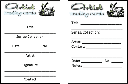 Final thoughts: the cards are actually too small to add anything else and personally I think adding way too much information on the card itself takes away from the guidebook. Having a guidebook is a great tool to get your thoughts flowing as you are not only thinking about what you have created but now you have to put it down in words... writing practice - another form of art.
Feel free to print a copy of the image that I have posted. The black borderline is 2.5" by 3.5" the typical ATC size. When I put these on my cards I cut the borderline away if I am creating curved corners but I keep the borderline if the cards are cut simply. I have already altered this to have a version for participating in swaps to include location and Swap name... so you can alter it too. Some have altered a similar template by adding something fancier at the top instead of the basic title that I have. You can download the MS PowerPointRaw template or printable MS Word document for any of the two templates from this folder: Public Google Drive Folder |
Author: RejiI used to be a digital artist but switched back to traditional art as I feel more connected with the art I create this way. Currently, I create art whenever I can for art trades and commissions. I have worked with clay (earth clay to modern forms like Polymer, Sculpey, even Air Dry clay) along with watercolors, acrylics, oil paints, pastels, charcoal, pen and pencil drawings, India ink, Chinese Colors, wires, felt fabric, yarn, weaving, basket making, and the list goes on and on. I am currently working on exploring nail art, make-up, dress making, scrapbooking, and small canvas art. Archives
April 2017
Categories
All
Copyright © Reji Randhawa | The Paradox Sketchbook. All rights reserved.
 All work on this blog is licensed under a Creative Commons Attribution-NonCommercial-NoDerivatives 4.0 International License. |
 RSS Feed
